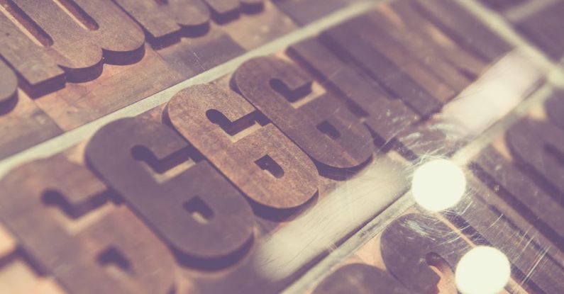
Typography plays a crucial role in web design, impacting how users perceive and interact with a website. As a web designer, understanding the principles of typography is essential for creating visually appealing and user-friendly websites. Here are some top typography tips for web designers to enhance the readability and aesthetics of their designs.
Choose the Right Font Pairing
Selecting the right fonts for your website is foundational to creating a cohesive and visually pleasing design. When choosing font pairings, consider pairing a serif font with a sans-serif font for contrast and readability. Serif fonts are ideal for body text as they enhance readability, while sans-serif fonts work well for headings and subheadings due to their clean and modern appearance. Experiment with different font combinations to find the perfect balance between readability and aesthetics.
Consider Readability Across Devices
With the rise of mobile devices, it is crucial to consider readability across various screen sizes. Opt for fonts that are legible on both desktop and mobile devices to ensure a seamless user experience. Avoid using overly decorative or intricate fonts that may be difficult to read on smaller screens. Additionally, adjust font sizes and line spacing to optimize readability on different devices without compromising the overall design.
Maintain Consistent Typography
Consistency is key in web design, especially when it comes to typography. Use a consistent set of fonts, sizes, and styles throughout your website to create a cohesive visual identity. Establish a hierarchy of typography elements, such as headings, subheadings, body text, and links, and maintain consistency across all pages. Consistent typography not only enhances readability but also reinforces brand identity and professionalism.
Pay Attention to Line Length and Spacing
The readability of text is greatly influenced by line length and spacing. Avoid using excessively long lines of text, as they can strain the reader’s eyes and make it challenging to follow the content. Aim for an optimal line length of around 50-75 characters per line for improved readability. Additionally, pay attention to line spacing, also known as leading, to ensure that text is comfortably spaced and easy to read. Adequate spacing between lines and paragraphs enhances readability and overall user experience.
Use Contrast to Emphasize Important Information
Contrast in typography can help guide users’ attention and emphasize important information on a website. Experiment with contrasting font weights, sizes, and colors to create visual hierarchy and draw attention to key elements such as headings, call-to-action buttons, and important messages. Utilize contrast strategically to make important information stand out while maintaining overall harmony and balance in your design.
Incorporate White Space for Visual Breathing Room
White space, or negative space, is a powerful design element that can enhance the readability and visual appeal of your typography. Incorporating ample white space around text elements helps create breathing room and allows content to stand out. Avoid cluttered layouts and ensure that text has enough space to breathe, making it easier for users to read and navigate your website. White space also contributes to a clean and modern design aesthetic.
Optimize for Web Performance
When selecting fonts for your website, consider web performance implications such as loading times and accessibility. Opt for web-safe fonts or utilize web font services like Google Fonts or Adobe Fonts to ensure compatibility across different devices and browsers. Limit the number of font styles and weights to reduce HTTP requests and improve loading speed. Additionally, prioritize accessibility by choosing fonts that are legible and meet contrast guidelines for users with visual impairments.
Conclusion:
Typography plays a crucial role in web design, influencing not only the aesthetic appeal but also the usability and readability of a website. By following these top typography tips, web designers can create visually engaging and user-friendly designs that effectively communicate with their audience. Remember to choose the right font pairings, maintain consistency, consider readability across devices, pay attention to line length and spacing, use contrast strategically, incorporate white space, and optimize for web performance to elevate the typography in your web design projects.